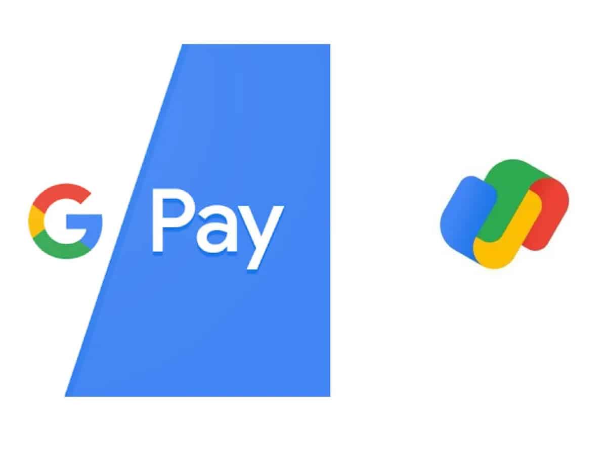
Hyderabad: Google has been giving all its workspace apps a facelift. It has now introduced a new icon for the Google Pay app. All the Google apps now have the company’s core colour scheme (red, green, yellow, and blue) and no longer have a unique identity.
Users today in India received an updated version of the “G Pay” App that features a new logo. It was first spotted by 9to5Google website. However, the older version of the App on iOs and Android hasn’t been updated with the new logo yet.
The new logo looks different from the previous logo, which was simpler. The new logo features primary colour blue, green, yellow and red from Google. Colour combination in the logo is similar to the new Google workspace logos.
There is no change in the Google Pay app other than the redesigned logo.
Google Pay gets a colourful new logo in India

